Code author: jhkwakkel <j.h.kwakkel (at) tudelft (dot) nl>
this module provides functions for generating some basic figures. The code can
be used as is, or serve as an example for writing your own code. These plots
rely on matplotlib,
numpy, and
scipy.stats.kde
-
plotting.lines(results, outcomes_to_show=[], group_by=None, grouping_specifiers=None, density='', titles={}, ylabels={}, legend=True, experiments_to_show=None, show_envelope=False, **kwargs)
This function takes the results from perform_experiments() and
visualizes these as line plots. It is thus to be used in case of time
series data. The function will try to find a result labeled “TIME”. If this
is present, these values will be used on the X-axis. In case of Vensim
models, TIME is present by default.
| Parameters: |
- results – return from perform_experiments().
- outcomes_to_show – list of outcome of interest you want to plot. If
empty, all outcomes are plotted. Note: just
names.
- group_by – name of the column in the cases array to group results by.
Alternatively, index can be used to use indexing arrays
as the basis for grouping.
- grouping_specifiers – set of categories to be used as a basis for
grouping by. Grouping_specifiers is only
meaningful if group_by is provided as well. In
case of grouping by index, the grouping
specifiers should be in a dictionary where the
key denotes the name of the group.
- density – boolean, if true, the density of the endstates will be
plotted.
- legend – boolean, if true, and there is a column specified for
grouping, show a legend.
- titles – a way for controlling whether each of the axes should have
a title. There are three possibilities. If set to None, no
title will be shown for any of the axes. If set to an empty
dict, the default, the title is identical to the name of the
outcome of interest. If you want to override these default
names, provide a dict with the outcome of interest as key
and the desired title as value. This dict need only contain
the outcomes for which you want to use a different title.
- ylabels – a way for controlling the ylabels. Works identical to
titles.
- experiments_to_show – numpy array containing the indices of the
experiments to be visualized. Defaults to None,
implying that all experiments should be shown.
- show_envelope – boolean, indicates whether envelopes should be
plotted in combination with lines. Default is False.
|
|---|
| Return type: | a figure instance
and a dict with the individual axes.
|
|---|
Note
the current implementation is limited to seven different
categories in case of column, categories, and/or discretesize.
This limit is due to the colors specified in COLOR_LIST.
-
plotting.envelopes(results, outcomes_to_show=[], group_by=None, grouping_specifiers=None, density='', fill=False, legend=True, titles={}, ylabels={}, **kwargs)
Make envelop plots. An envelope shows over time the minimum and maximum
value for a set of runs over time. It is thus to be used in case of time
series data. The function will try to find a result labeled “TIME”. If this
is present, these values will be used on the X-axis. In case of Vensim
models, TIME is present by default.
| Parameters: |
- results – return from perform_experiments().
- outcomes_to_show – list of outcome of interest you want to plot. If
empty, all outcomes are plotted. Note: just
names.
- group_by – name of the column in the cases array to group results by.
Alternatively, index can be used to use indexing arrays
as the basis for grouping.
- grouping_specifiers – set of categories to be used as a basis for
grouping by. Grouping_specifiers is only
meaningful if group_by is provided as well. In
case of grouping by index, the grouping
specifiers should be in a dictionary where the
key denotes the name of the group.
- density – boolean, if true, the density of the endstates will be
plotted.
- fill – boolean, if true, fill the envelope.
- legend – boolean, if true, and there is a column specified for
grouping, show a legend.
- titles – a way for controlling whether each of the axes should have
a title. There are three possibilities. If set to None, no
title will be shown for any of the axes. If set to an empty
dict, the default, the title is identical to the name of the
outcome of interest. If you want to override these default
names, provide a dict with the outcome of interest as key
and the desired title as value. This dict need only contain
the outcomes for which you want to use a different title.
- ylabels – a way for controlling the ylabels. Works identical to
titles.
|
|---|
| Return type: | a figure instance
and a dict with the individual axes.
|
|---|
Additional key word arguments will be passed along to the density function,
if density is True.
| property |
description |
|---|
| log |
log the resulting histogram or GKDE |
an example of use
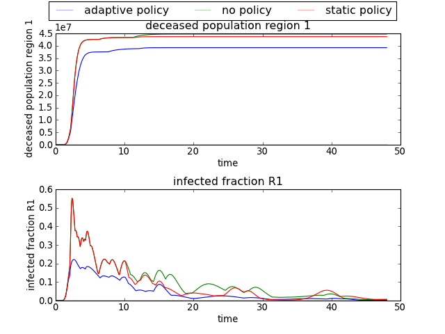
>>> import expWorkbench.util as util
>>> data = util.load_results(r'1000 flu cases.cPickle')
>>> envelopes(data, column='policy')
will show an envelope for three three different policies, for all the
outcomes of interest.
[source code, hires.png, pdf]
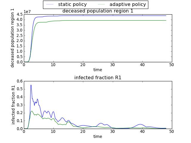
>>> envelopes(data, column='policy', categories=['static policy', 'adaptive policy'])
will only show results for the two specified policies, ignoring any results
associated with ‘no policy’.
[source code, hires.png, pdf]
Note
the current implementation is limited to seven different
categories in case of column, categories, and/or discretesize.
This limit is due to the colors specified in COLOR_LIST.
-
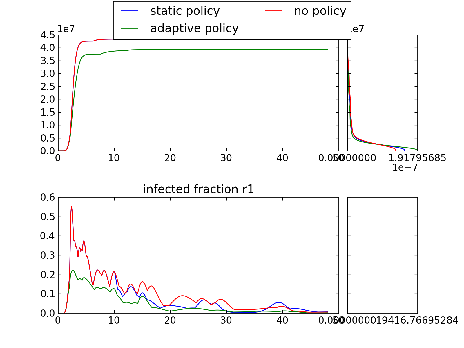
plotting.kde_over_time(results, outcomes_to_show=[], group_by=None, grouping_specifiers=None, results_to_show=None, colormap='jet', log=True)
This is the 2d equivalent of 3d envelopes, where the density is visualized
through a heatmap, rather then in the third dimension.
| Parameters: |
- results – return from perform_experiments().
- outcomes_to_show – list of outcome of interest you want to plot. If
empty, all outcomes are plotted. Note: just
names.
- group – name of the column in the cases array to group results by.
- grouping_specifiers – set of categories to be used as a basis for
grouping by. Categories is only meaningful if
column is provided as well. Note: grouping
specifiers should be an iterable.
- colormap –
- log –
|
|---|
- TODO:: a colorbar boolean should be added. This controls whether a
- colorbar is shown for each axes.
-
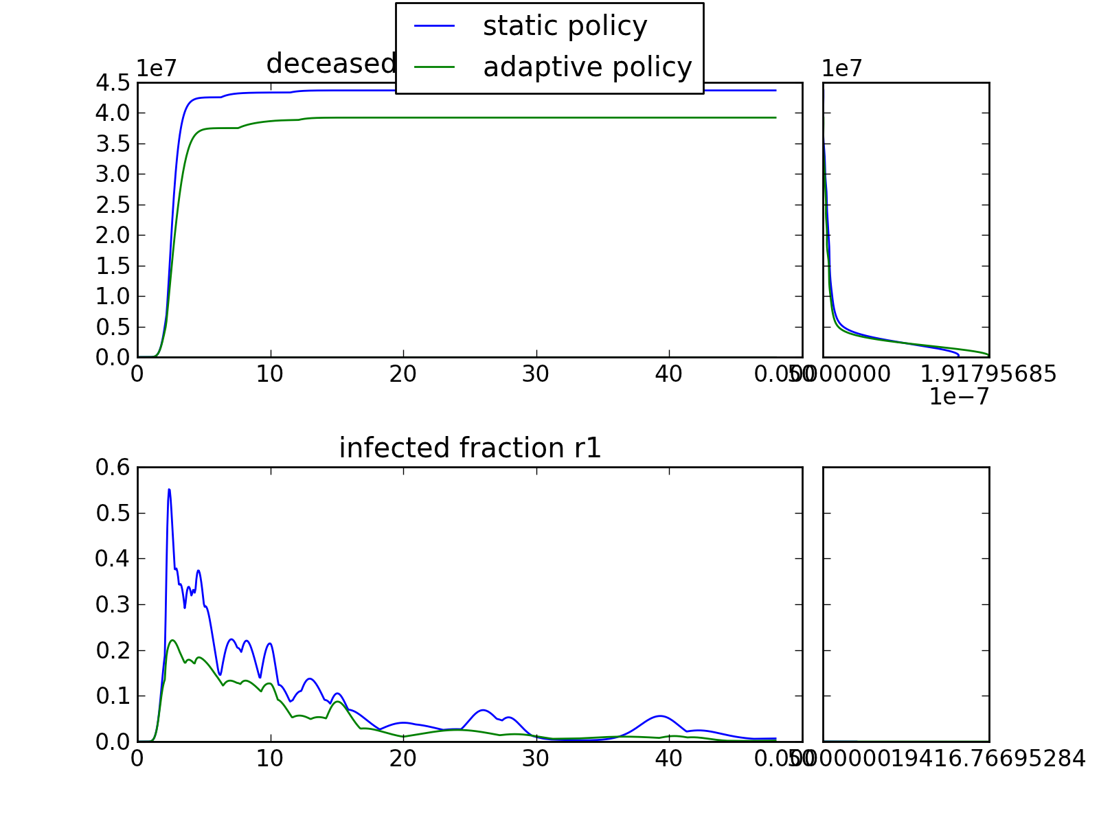
plotting.multiple_densities(results, outcomes_to_show=[], points_in_time=[], group_by=None, grouping_specifiers=None, density='kde', titles={}, ylabels={}, legend=True, experiments_to_show=None, plot_type='envelope', **kwargs)
Make an envelope plot with multiple density plots over the run time
| Parameters: |
- results – return from perform_experiments().
- outcomes_to_show – list of outcome of interest you want to plot. If
empty, all outcomes are plotted. Note: just
names.
- points_in_time – a list of points in time for which you want to see
the density. At the moment up to 6 points in time
are supported.
- group_by – name of the column in the cases array to group results by.
Alternatively, index can be used to use indexing arrays
as the basis for grouping.
- grouping_specifiers – set of categories to be used as a basis for
grouping by. Grouping_specifiers is only
meaningful if group_by is provided as well. In
case of grouping by index, the grouping
specifiers should be in a dictonary where the
key denotes the name of the group.
- density – field, either KDE or HIST
- titles – a way for controlling whether each of the axes should have
a title. There are three possibilities. If set to None, no
title will be shown for any of the axes. If set to an empty
dict, the default, the title is identical to the name of the
outcome of interest. If you want to override these default
names, provide a dict with the outcome of interest as key
and the desired title as value. This dict need only contain
the outcomes for which you want to use a different title.
- ylabels – a way for controlling the ylablels. Works identical to
titles.
- legend – boolean, if true, and there is a column specified for
grouping, show a legend.
- experiments_to_show – numpy array containing the indices of the
experiments to be visualized. Defaults to None,
implying that all experiments should be shown.
|
|---|
| Plot_type : | kwarg for controling the type of main plot. Can be one of
ENVELOPE, LINES, or ENV_LIN
|
|---|
| Return type: | a figure instance
|
|---|
Additional key word arguments will be passed along to the density function,
| property |
description |
|---|
| log |
log the resulting histogram or GKDE |
an example of use
Note
the current implementation is limited to seven different
categories in case of column, categories, and/or discretesize.
This limit is due to the colors specified in COLOR_LIST.
Note
the connection patches are for some reason not drawn if log
scaling is used for the density plots. This appears to be an
issue in matplotlib itself.